Friday, 23 October 2009

Our film production logo

After analysing previous film production and distribution logo's myself and Amy have come up with an idea for our own logo. By analysing other logo's it has helped us to understand what a professional logo should look like and how different logo's appeal to different genre types.


As our genre is horror, we want to create a production logo that will suit this genre, seen in logo's such as 'Twisted Pictures', used by films like Saw. This image is shown below and uses dark colours, which connotes death, evil and mystery as it is bold and hard to see through, which creates the fear of the unknown. The image is a nail with barbered wire round it, which is dangerous as it has the potential to hurt someone and can also be seen as a warning, as barbered wire is often used to protect something, or keep someone out.

Our image that we have created consists of an eye looking through a keyhole. Our image is very dark and uses charcoal effects on Photoshop with a hint of red to create an old worn look, we have manipulated the colour to make it sepia, this colour connotes danger and the 'old' look also enforces the fear of the unknown as we are unaware of what happened as we weren't there to experience it. The concept of someone looking through a keyhole represents the fear of the unknown and being forbidden. The audience also feels like they are unaware of what is happening as they don't know who is looking into the hole and what is behind the hole. It makes the audience feel uneasy as they feel as if they are being watched as the eye looks directly into the camera. This makes the audience connect with the image as they look back into the eye. Creating this logo has given me an insight to the production world. It has also helped me to create synergy with the genre and every aspect of the trailer. When we decided to show our initial logo to our peers and gained feedback, a lot of people said that they felt that they could not see what the image behind the keyhole was. (shown to the right)


We then decided to change our image and make sure that the eye in our logo could be instantly recognised. We took another photo of Amy's eye and ensured that it was a clear image that we could use, which is shown to the right. We then manipulated the photo on Photoshop by using our previous idea. Instead of using the charcoal filter we decided to use the filter 'Sumi-e', which is similar to
'fresco' but gives a less texturised effect, therefore making the image more clear. We also manipulated the curves, brightness and contrast and the levels of the image to make it more striking. As shown below the original image.


Through our research we came across various styles of distribution and production logos. From this research we could see what was most effective, and why and how it was. We could see that the production logo often reflects the genre of the film that it is creating, therefore attracting a target audience through their logo. As Amy and I have decided to create a film that is in the genre of horror we have decided to create a logo that portrays this. Therefore we have planned to call our Production company 'Hostile Productions'. By calling our production company 'Hostile Productions' it implies anger, or solidarity. This is the final production logo that me and Amy have created. We feel that this logo is the most effective as you can see that it is an eye, and that it is looking through a keyhole. By using a brush with less definition it makes it appear that we have included a depth of field and is almost like a photograph. The contrast in the image makes it more striking and this will draw the attention of the audience in. We have used a typewriter font that is often used for horror films, we have altered the lettering so that some of the letters are wonky this makes it more interesting and unusual.

Tuesday, 20 October 2009

Music

We have decided to take influence for our music from a trailer that we looked at for our research- 'Last house on the Left'. In this trailer they have used the song 'Sweet child of mine' which relates to the plot of the trailer but also makes the trailer more memorable as there was a sharp contrast between the happy atmosphere of the song and the horror actions of the film. This sharp contrast is often used in Tarentino films that we have looked at such as 'Resevior Dogs'.

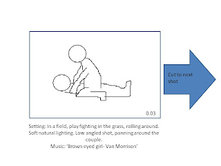
We have decided to use 'Brown Eyed Girl'- by Van Morrison as it is a happy song that we feel depicts the feeling of love. The lyrics talk about two people being in love from the males perspective and it talks about playing around and having fun in the grass- this relates to our shots that we are planning to use. The end of the song talks about the split up between the two lovers which foreshadows the break up of love and danger that Sophie is going to experience although it is still being sang in a happy tone therefore showing how blissfully unaware she is of this fact.

The other song that we have chosen is 'Little Lies'- by Fleetwood Mac- This song again is about a break up between two lovers. This is apprropriate as we are using this song for the end of the trailer when everything begins to go sour. The lines in the song 'no you cant disguise' and 'Were better off apart' reflect Bowe's visade as a loving boyfriend, as now he will be revealed as a rapist and murderer and can not 'disguise' himself anymore. The line 'Were better off apart' also acts as a warning to Sophie, as if they do not break up then she will end up in danger, which is ironic. This line also reflects the trust that lovers should have, 'to believe in you', however in this case it shows Sophies naievity towards Bowe and the situation, as she should not 'believe' in him as she does. The use of these songs are incongruent to the theme of the film and the juxtaposition creates an ironic and sad feeling, as it highlights the innocence she has lost.

Creating our script

Amy and I decided that we should create a script for our teaser trailer so that when it comes to filming we know exactly what we want and the actors and actresses know exactly to do and have time to learn what they have to say. This minimises time waisting.

Our script:
(Shot 1)
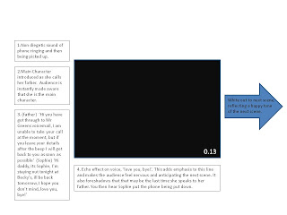
-Father- Hi you have got through to Mr Greens voicemail, I am unable to take your call at the moment, but if you leave your details after the beep I will get back to you as soon as possible

-Sophie- Hi daddy, its Sophie, I'm staying out tonight at Becky's, ill be back tomorrow, I hope you don't mind, love you, bye!

(Shot 4)
-Sophie- I love you (directed at Bowe)

-Bowe- Me too

(Shot 5)
Sophie-(Laughs)

Bowe- I'm goin' to get you

(Shot 21)
Juliet- Hello?

Bowe- Hey, your sisters run away, I cant find her anywhere, I'm really worried, please come help

Juliet- I'll be straight over, don't worry.

Wednesday, 14 October 2009

Plan of Action

We used a bedroom in my house to film this scene and removed all objects that gave any sign of humanity and serenity, such as a picture frame and a chess piece. The room is beige and gives a lifeless feeling to it. We turned off the lights to create a sinister atmosphere and used a lamp in the corner of the room to still ensure there is light in the room, although we can edit this on adobe premier.We have used a domestic setting as we found through our research that the majority of our target audience found a domestic setting scary and they found a story line they can relate too was scary, therefore by using a bedroom with typical furniture in it, our audience will be able to relate to it better. As it is a domestic setting the area is safe and there is no potential fire hazards or areas in which people could trip up or hurt themselves. We should be careful moving things around the bed as on the left hand side it does become quite narrow and we could potentially fall over. As the lighting will be low we should also ensure there is nothing that could trip us up. We will be filming at night so there will be no natural lighting, all light included will be artificial and created by the lamp in the right hand corner. We plan to cover this light with a cloth and therefore should ensure that it is not there for a prolonged period or too close to the light bulb to prevent possible fire hazards. As it is a domestic setting we have control over any unexpected sounds and there is limited interruption from the outside, weather will not majorly influence our filming time either.


Wooded location:
These are images from our location for the shots in which Sophie is running away from Bowe in the woods. We have chosen a small wooded area as we decided that we don't need a large area as the clips we will be using are only short. Although we will be filming in the dark and you wont see much of the surrounding setting we feel that this location is ideal as there is no interruption of roads of bright lighting but it isn't as dark as the woods so therefore we will have ideal lighting. There is a pathway that runs through this woods this will give the actor and actress a clearing in which they can run with out tripping up. By using an outdoors wooded setting we are appealing to our target audience as quite a few said that they would find this a scary setting. We should ensure we check all areas before using it for any sharp objects for example needles, if there is any uneven ground we should ensure that the actors are aware of it to prevent them tripping up and hurting themselves. We should clear a path for them so they don't trip over roots or rubbish. The weather will massively influence this shot, if it is raining we will be unable to carry it out due to possible damage to equipment. We will be filming at night for this shot so all light will be either from lamp poles outside this area and we will have to take a torch if it is too dark to ensure safe movements and too provide extra light if necessary.


- Character 1- Sophie Green (main female character)- A 16 year old girl who has an innocent but mischievousus character and is really in love with her boyfriend. We have chosen a teenage actress to play the role of this female. She is a pretty dark haired girl, who can fulfill the 'innocent' image due to her her good looks, but as she has short dark hair she also gives of a mischievous impression. We also chose our actress as she is a slim build, but not too thin and therefore our female audience can relate to her. Because she is slim she also appears defenceless and physically weaker than our choice of male, this therefore makes our storyline believable. We want our target audience to feel like they can relate to Sophie as we found out through our research that they preferred a storyline they could relate too. After carrying out research into what is the latest trends for this autumn we have decided to dress her in an outfit similar to the one on the right. This outfit shows the season (autumn) and that she is a young, trendy girl. The outfit covers a lot of skin, but is at the same time revealing her figure and this reflects the mischievous nature of our character. The outfit appears casual and therefore appropriate for the setting of the field, and it also reflects that she is comfortable in her relationship.


Here is an image of our actor Talia Feld. She has GCSE in drama and she is studying performing arts at Bedford college. Both myself and Amy know Talia and have seen her act before, we therefore feel that she is fully capable of playing our main character Sophie.


-Character 2- Bowe (main male character)- A 22 year old male. This character appears to be sneaky and sly. The audience can tell that there is a sinister aspect to his personality by the way that he interacts with Sophie. We have chosen a young male actor who appears to be well built and bigger. We have decided to make him a teenager so that our target audience can relate to his character. We have chosen an average looking male so that the audience can also relate to him, or feel that they know someone in their personal lives who is similar to him. The reason we have done this is because we discovered through our research that audience like a plot that they feel they can relate to. We have researched male fashion for this autumn so that our target audience can again relate to what Bowe is wearing (shown to the right). Through this outfit we have chosen it reflects his character as the leather jacket reflects a 'bad boy' image, and the hat shows that he is hiding something and is slightly deceiving. This outfit gives off the general impression that this character is a 'bad boy' and is rebellious. The choice of colour reflects his dark side of his character.


-Character 3- Juliet (Sister of Sophie)-A caring supportive and protective character. Juliet is 24 years old and the sister of Sophie. Her and Sophie have a close relationship and love each other a lot. They also share a lot of secrets with each other. As children Juliet has always looked out for and protected Sophie, and Sophie began to resent it, and felt as if Juliet was a second mother. At the beginning of the film the two sisters argue about this, as Juliet begins questioning where shes going and who with. She wears casual clothes that reflect an easy going character. She appears gentle and soft but also has an older appearance than Sophie indicating that she is a responsible adult.


Props:


-Blooded T-shirt (for shot number 12)


-Fake blood (for shot number 19)


-Television (for shot number 13)


-DVD (for shot number 13)


-Rope (for shot number 17)


-Bed (for shot number 17)


-Knife (for shot number 23)


Timeline of filming:


Friday 6th November:


During the afternoon of Friday we are planning to film shot numbers 3, 4 & 5 that get repeated and are used for shot numbers 6-11 as well. We have decided to film these out side shots at this time as we have looked ahead at the weather forecast and it is supposed to be a sunny day. This weather is appropriate for us as in shot number 3,6 and 9 we have specified that we want the sun to shine between Bowe and Sophie. By filming in the afternoon and this time of year we can ensure that the sun will be in the correct place and wont be too bright and the lighting will be quite soft which is good as it reflects the atmosphere we want to create through these shots.


Saturday 7th November (evening):


We are planning to film shot numbers 16,18 and 20 at our outside wooded location. Due to this time of year the sun will set quite early on in the evening, we therefore want to film these shots at about 5.30pm as the sun will have just set and it wont be too dark for filming. Later on in the evening we have decided to film shot numbers 12,13,17, 19, and 23. These shots are filmed in our inside domestic house setting, we need these to be shot at night as it needs to be dark enough for us to create the right atmosphere.


Monday, 12 October 2009

Analysis of Production and Distributors logos

This is a logo for Paramount distributors. The image used if very iconic and representational, and will easily recognised again and again by the audience. The name 'Paramount' means to have superior power or influence, this implies that Paramount is the best distriubtor and therefore sets the standard for the film the audience is watching. The typography is fairly simple, and the title is positioned at the peak of the mountain again reflecting a sense of superiority. It represents the pinnacle of sucess that Paramount have. The stars represent their high status or a celebrity factor to the films. I feel that although this logo is effective, I feel that it isnt intresting enough to represent a horror film and therefore this style isnt appropriate for my trailers logo.


This logo is for Pathe a film distribution company. This logo appears child like due to the font and the use of bright colours, and the image of a chicken. The fact the chicken has a speech bubble coming out of it reflects again a child like nature, possibly implying that Pathe work alot with commical or childrens films.


This is a logo for 20th Century Fox. This image is very iconic and doesnt represent any specific genre. The use of spotlights and the low angled shot reflects that the company has a high status and is famous and of importance, this therefore implies that the film does aswell. The fact that the writing is a lighter colour to the rest of the image makes it stand out and appeal to the audience. By not simply having normal typography and instead making the typography into an object it therefore makes the logo more intresting and eye catching.


This is the logo for Warner Brothers Distribution Company. The logo immediately stands out as it very bright, due to the use of contrasting colours. The use of a crest implies high status and importance; this suggests the film will be of a high standard. The use of the crest resembles a superhero badge; this implies that it is for children or a playful film. This is therefore not an appropriate style for our distribution logo as we are aiming for a more serious atmosphere to our trailer.


This logo is for Icon film Distribution Company. This logo is relatively simple, which is memorable and effective. The name of the company relates to the style of the image as it appears iconic. The image of an eye plays on the letter ‘I’ and therefore reinforces it. The lettering style is simple and easy to read, it is in black and bold, therefore this stands out compared to the lighter colours of the image. We feel that this icon is effective because of this. If we could improve this icon would make it more interesting by adding a stronger colour influence.


This is the logo for Pixar animation studios. Pixar create mostly childrens animated films. The replacement of the 'I' with a lamp maybe reflects the fact that they are the source of animation footage. The typography used is simplistic and easy and clear to read. By having no other distractions of images it really allows the audience to focus on the name of the company. By using the lamp instead of the 'I' it makes the logo appear more unusual and differnt possibly implying that Pixar is a differnt non-average studio. As this logo is simplistic I feel that it doesnt represent the childish nature of the films that it creates and therefore I think that it doesnt not appeal to its target audience as a still image, although if it is watched as a beginning to a film the lamp dances around and therefore this will appeal to children or young people. Therefore I feel that as a still image this logo isnt effective, but I do feel that it is effective as a moving image. This logo is not appropriate for my genre as it is aimed at a younger childish audience where as my chosen genre of horror would need a more sinister logo.

Adding further detail to our storyboard

Amy and I decided that our initial storyboard lacked enough detail. As we now have a greater understanding of our audience and our chosen genre and we have also finalised our storyline we have therefore decided to create a more detailed storyboard with more accurate technicalities. We have created our storyboard on PowerPoint as we felt this was the easiest way to create it electronically. Each new slide represents a different shot, and we have inserted simple illustrations into the slide to illustrate our ideas. Around each image we have included annotations detailing shot types, camera movements, whether there is a zoom and if it is slow or fast, music, transitions and the length of the shot.

This level of detail has now given us a visual support for when we come to create our trailer. By doing this we really broke down what we wanted to do and the moods we wanted to create. Before deciding out technicalities we sat down together to discuss the impact we wanted to create on the audience and the most appropriate shot type and editing skills we could use to do this. As we began discussing it, we came up with more creative and imaginative ideas therefore improving on the storyboard and plot we had already created. We have decided to use music that is of a happy nature for example 'Brown eyed girl'- by Van Morrison, and 'Tell me Lies'- by Fleetwood Mac. The reason we decided to do this is because we have taken inspiration from 'The Last house on the left' trailer that we analysed earlier on in the project. Through out 'The last house on the left' trailer the song 'Sweet child of mine' plays, this is very effective as it is contradictory to what we are seeing. The music also bares relation to the story line as it 2 parents seeking revenge on people who have hurt their daughter. This is the reason why we have chose the music for 'Tell me lies'. We have decided that we will emphasise certain sounds through out the trailer, but have the music running constantly throughout the trailer.

By planning with a lot more detail I now feel more confident and happy with the trailer and feel that we are now closer to being ready to film, and will create a good outcome if we stick to our storyboard strictly.