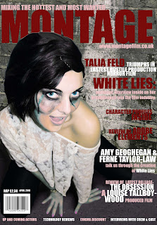
After completing two possible designs for our final cover we carried out a focus group to gain peoples opinions and ask which one they preferred. The majority of people said that the cover with the dark red writings image was too dark. They felt that the colour palette was dull and it made the image not stand out, and that you loose definition of edges of the actress, and there is less blood visible. They felt that her skin looked horrible and it looked a lot nicer and fresh on the other version. They felt that the image looks alien due to the blue toned skin, and the areas of blue blood, they said that it portrays a sci-fi based film/ mystical film based on vampires etc, this is obviously not the impression we want our target audience to have of our cover as it is the wrong plot. The fact she appears alien makes the audience feel like they can relate to her and this detaches them from the cover and decreases the likelihood that they would purchase the magazine.

They felt that the cover with the white writing is more successful due to the fact she stands out more as she is bright and colourful and the background is dull. They felt that the blood looks a lot better, and the image looks more seductive. The edges are a lot smoother around her head.
the blood looks seductive and that the colour of it is vibrant and stands out. The image appears more comical and less sinister with the brighter colour influence which is good as this was the aim of our image, to be sinister with a quirky edge. They liked the fact the writing links to the top and makes the writing relate and combine with the image rather than being two separate components.
From this focus group we can clearly see what our audience prefer to see, many of them said the initial one wasnt appropriate for a magazine cover, as most images on magazine covers are glamouruse and therefore the 1st design doesnt suit the conventions and what people are expecting to see. It is vital that we appeal to our audience effectively and although we wanted to create an unusual and quirky cover, we have to still ensure it appeals to an audience to maximise profits and sales. We have listened to our audience and created something that they are happy with and is in keeping with our initial research into our target audiences expectations.
No comments:
Post a Comment