Tuesday, 20 April 2010

Colour scheme for Magazine cover

For our magazine cover it is important that we choose the right colours to reflect our magazines content and its brand identity. It also needs to fit in with the main cover line, which is about our horror film 'White Lies'.

We initially thought about using colours that are conventionally associated with the genre of horror, such as black and red to represent darkness and blood. However we felt that this was extremely depressing and didn't reflect the content we wanted to explore. This is because we wanted to explore the actress of our character so we have used contrasting images, which is also shown in our colour scheme. We decided to use the colours of white and peach. This is because they both have associations with innocence, which are important to reflect the girlie side to our actress and create a contrast with her role and portrayal of her character. We have also decided to use a background to make it seem more professional as oppose to a colour, which we thought would have made it look amateur. We decided to use a brick wall, which has a tough approach as it is on the street and has a rough surface, which supports the character that Talia plays.

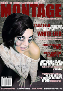
Final focus group for magazine cover

In order to see if our magazine cover was successful, we decided to run a focus group. This meant we gathered people from our target audience, showed them our magazine cover and collected feedback on aspects they thought were successful and aspects which could be improved. The overall feedback was:

- The pose of the model is very successful as she draws in the reader because she is leaning out to the audience and looking at you. This helps to attract our audience, which will increase our sales and show that it is a successful presentational device.

- The colouring of the coverlines are attractive and very interesting in comparison with the harsh image. However there are some words which are harder to read because of the background.

- The title stood out and was thought of well. It helps to convey the magazines identity by showing that it covers different subject matters and is a visual image for a visually themed magazine.

- They also thought that there was a good cross section of subject matter. However they believed that not all readers would know what adobe was and thought we could have used a more well known technological subject as a coverline.

Focus group on two designs


After completing two possible designs for our final cover we carried out a focus group to gain peoples opinions and ask which one they preferred. The majority of people said that the cover with the dark red writings image was too dark. They felt that the colour palette was dull and it made the image not stand out, and that you loose definition of edges of the actress, and there is less blood visible. They felt that her skin looked horrible and it looked a lot nicer and fresh on the other version. They felt that the image looks alien due to the blue toned skin, and the areas of blue blood, they said that it portrays a sci-fi based film/ mystical film based on vampires etc, this is obviously not the impression we want our target audience to have of our cover as it is the wrong plot. The fact she appears alien makes the audience feel like they can relate to her and this detaches them from the cover and decreases the likelihood that they would purchase the magazine.


They felt that the cover with the white writing is more successful due to the fact she stands out more as she is bright and colourful and the background is dull. They felt that the blood looks a lot better, and the image looks more seductive. The edges are a lot smoother around her head.
the blood looks seductive and that the colour of it is vibrant and stands out. The image appears more comical and less sinister with the brighter colour influence which is good as this was the aim of our image, to be sinister with a quirky edge. They liked the fact the writing links to the top and makes the writing relate and combine with the image rather than being two separate components.


From this focus group we can clearly see what our audience prefer to see, many of them said the initial one wasnt appropriate for a magazine cover, as most images on magazine covers are glamouruse and therefore the 1st design doesnt suit the conventions and what people are expecting to see. It is vital that we appeal to our audience effectively and although we wanted to create an unusual and quirky cover, we have to still ensure it appeals to an audience to maximise profits and sales. We have listened to our audience and created something that they are happy with and is in keeping with our initial research into our target audiences expectations.

Wednesday, 7 April 2010

four final images

Here are the four images that we have narrowed our photoshoot down to. We took two photos where half of her face is normal makeup and the other half is covered in blood and bruising and we have two photos of her whole face in blood and bruising. We thought these photos were the most effective images as you can clearly see the contrast in herself as an actress and as her character through her makeup and her body language.


This is one of our favourite images as her makeup gives a shocking impact but juxtaposes her cheeky pose. This contrast is very effective as we are drawn in through her eyes that grab your attention, which instantly brings attention to her face. This is contrasted with her top which is white lace, that has connotations of innocence and purity. However as it is see through it shows her rebellious and seductive side of her character and also her as an actress. Her pose is also very seductive as she has her legs open and is looking up at the camera trying to gain the audiences attention, which contrasts with her bloody face as you would expect her to look sad or in pain.


This image is similar to the one above however this image isn't as playful as the other one, as her facial expressions are more serious with a slight smile, which could be interpreted as more manipulative.

This image is very stylised and uses a clear shot of the different makeup, which identifies the actress and the character. The pose of Talia is with her head tilted back, which is a very glamorous and sexualised shot to emphasise the detachment from her character and the bloody make up. We have also used the white lacy top with her shoulder out on the side of her made up face, which also emphasises the glamour associated with the career of an actress.


This image focuses on Talia's face, which allows us to have a close up view of her make up and her facial expression. Her facial expression is cheeky with her tongue out on the side of her glamorous face and she also has a smile, which contrasts with the bloody bruised side of her face. This shot is also face on, which shows a clear contrast between the actress and her character. We felt that her outfit would have looked better with the white lacy top to emphasise the difference.

our photoshoot

For our photoshoot we wanted to portray the actress and the character as one person. We wanted to used a clear divide between the two and came up with the idea of using different makeup. We first of all did half of Talia's face in makeup of bruising in blood, which is seen in the trailer and also in the poster of the film. We then did half of her face in blood and bruising in contrast with girlie makeup to reflect the actress. We also then made her full face in blood and bruising contrasted with fun, sexy shots to reflect the actress in a shocking way. We also took some shots with a cigarette to show her rebellion and we could also draw on comparisons with iconic Marilyn Monroe images and use that as the actresses inspiration.


We wanted to encorporate the character as it is a micro media production we can't rely on the actresses reputation to sell the film. The shocking images of Talia bein beaten up are used to grab people's attention and relate it to the character. We took some photos in which her expression was sad and serious to reflect her character, but we felt that by using fun and cheeky expressions we can reflect the actress and create attention of the film by creating controversy.


All of face blood and bruised:


Marilyn Monroe cigarette inspiration shots:


Half of face blood and bruised and half with girlie makeup:


Half of face blood and bruised and half plain makeup:


Inspiration for photoshoot

Myself and Ferne took inspiration from the image of Megan Fox on the cover of Empire magazine, as we thought that how the words shaped around her body was very effective, which is what we used in our own magazine cover. We also took inspiration from her sexy look, which we used for Talia's pose in contrast with her brutal make up. We have also taken inspiration from the magazine cover 'Fabulous', which although is not a film magazine, inspired us to show Talia as an actress and character through one image. This is because we found this image very interesting and it grabbed our attention, which is something we wanted to achieve with our own magazine cover. We also found that it allowed us to do something different compared to the other film magazine images we have seen to create an individual style.

Mock ups for magazine cover


This is image will be of our antagonist with the text around him. We were inspired from our research of the image of Megan Fox and the way in which the text goes around her reflecting her importance. The title is clear and will stand out, we would put the title behind the image as this is a key convention that we have noticed through our research and it reflects confidence in the company. The image will be shot in the domestic home setting therefore relating back to the trailer. We planned for this to be a close up of his face. The colour theme will be dark and sinister reflecting the evil nature of this character. We decided not to use this as our final plan for our cover as we felt that it would ruin the mystery that we have created within our trailer of the attacker being unknown.


This image will be the same as the one that we have used for the film poster. This creates continuity between all medias relating them back together so that the audience can relate them together. The text will go around the image again as we were inspired by the front cover that featured Megan Fox. The colour pallete will be similar to the posters colour theme and the main colour influence will be red as it connotes our chosen genre. We have decided not to use this as our final mock up as it is too similar to the poster and therefore doesnt give away more clues to the film which doesnt give the audience any more information and therefore no desire to buy the magazine.


This draft shows our heroine of the film in a very different light, which will surprise consumers as they will not be used to seeing this flirtatious image of her. The shot will be taken from a high angle shot, which will help to portray her weakness as a character but also in contrast her facial expressions will reveal her 'actress' within as cheeky and bubbly. This image is also inspired by the Empire magazine front cover of Megan Fox, in which the text curves around her shape, revealing her importance and also creating an aesthetical appeal in the line on the magazine cover. We also wanted to make the image harsher by using a background of a brickwall with tarmac flooring, which makes the image look more high fashion revealing the actresses interests. It also can be seen as representative of the actresses past, as she has just made it in the film industry coming from a working class background. We will also use a colour theme of bright colours to reflect the actress in contrast with the harsh image of her beaten face.